Docs
Dashboards
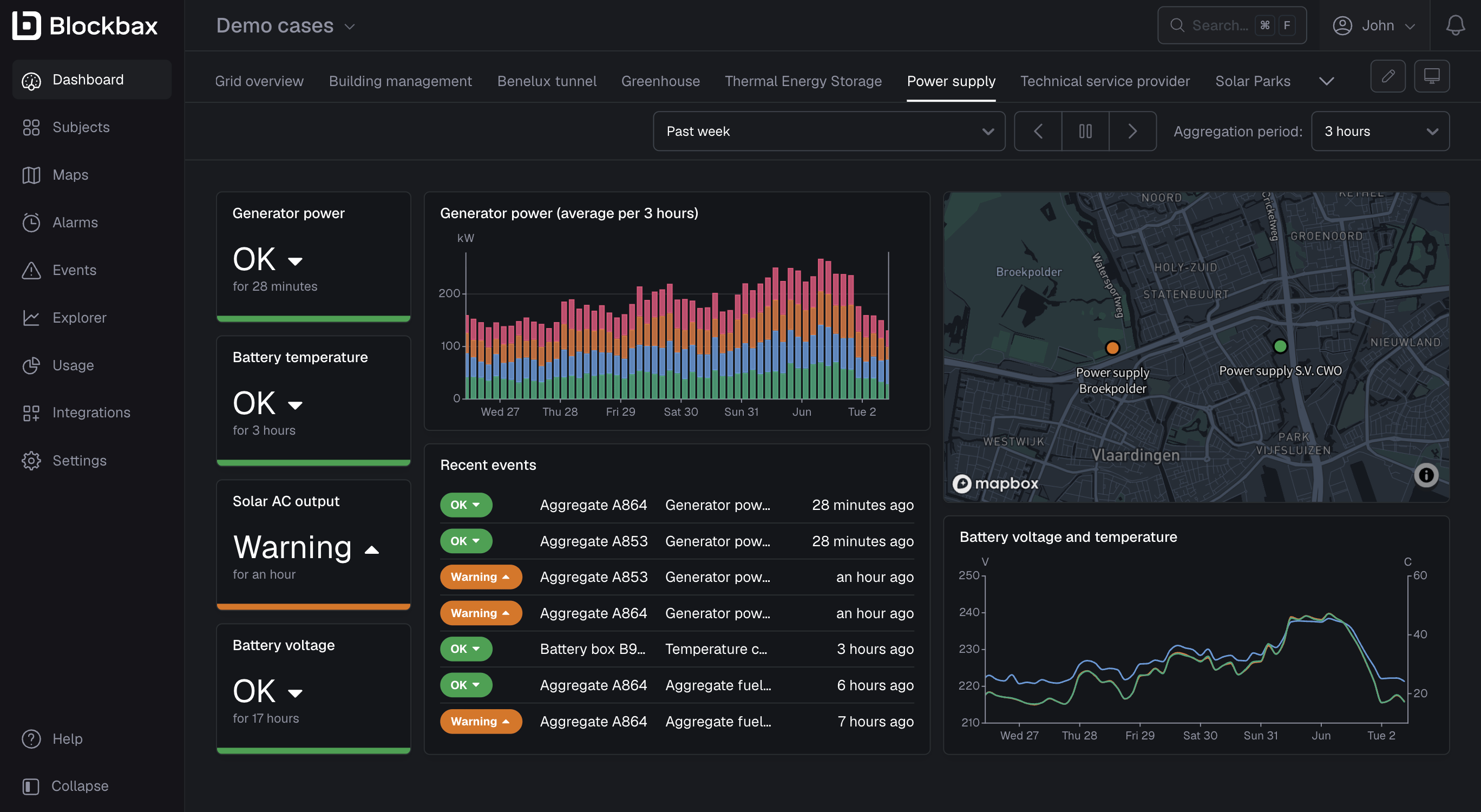
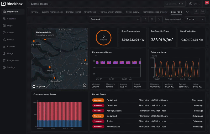
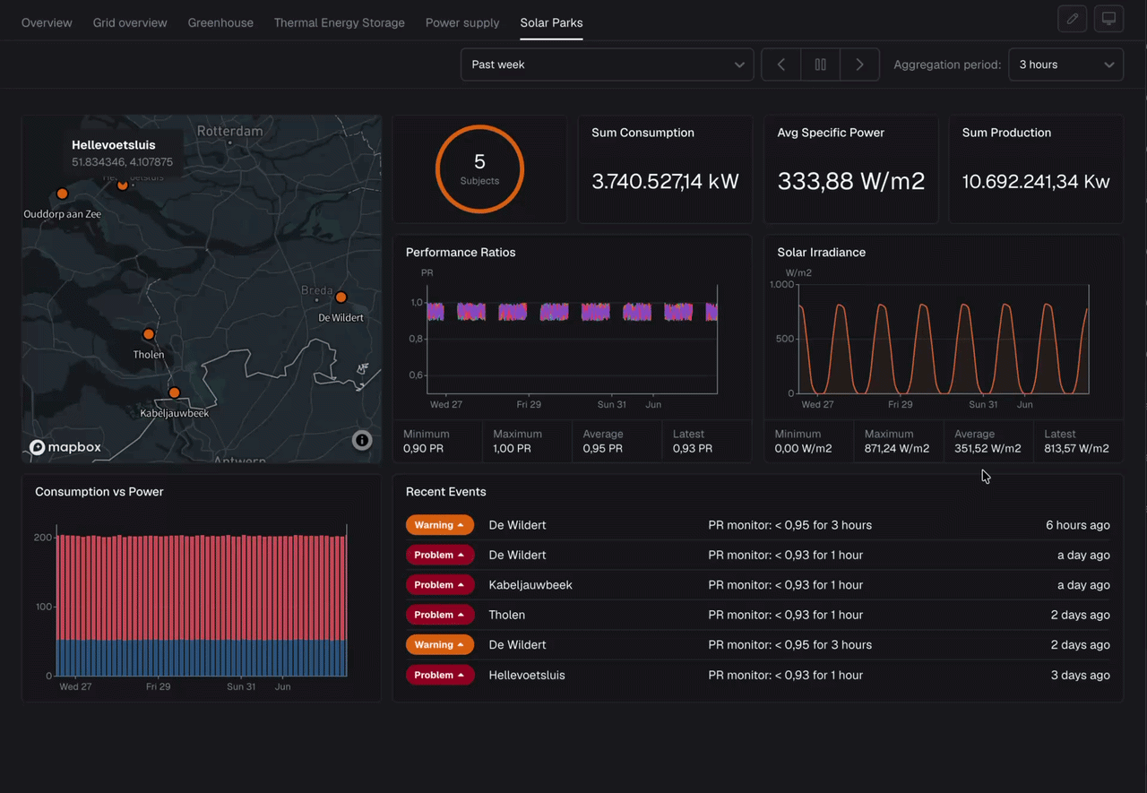
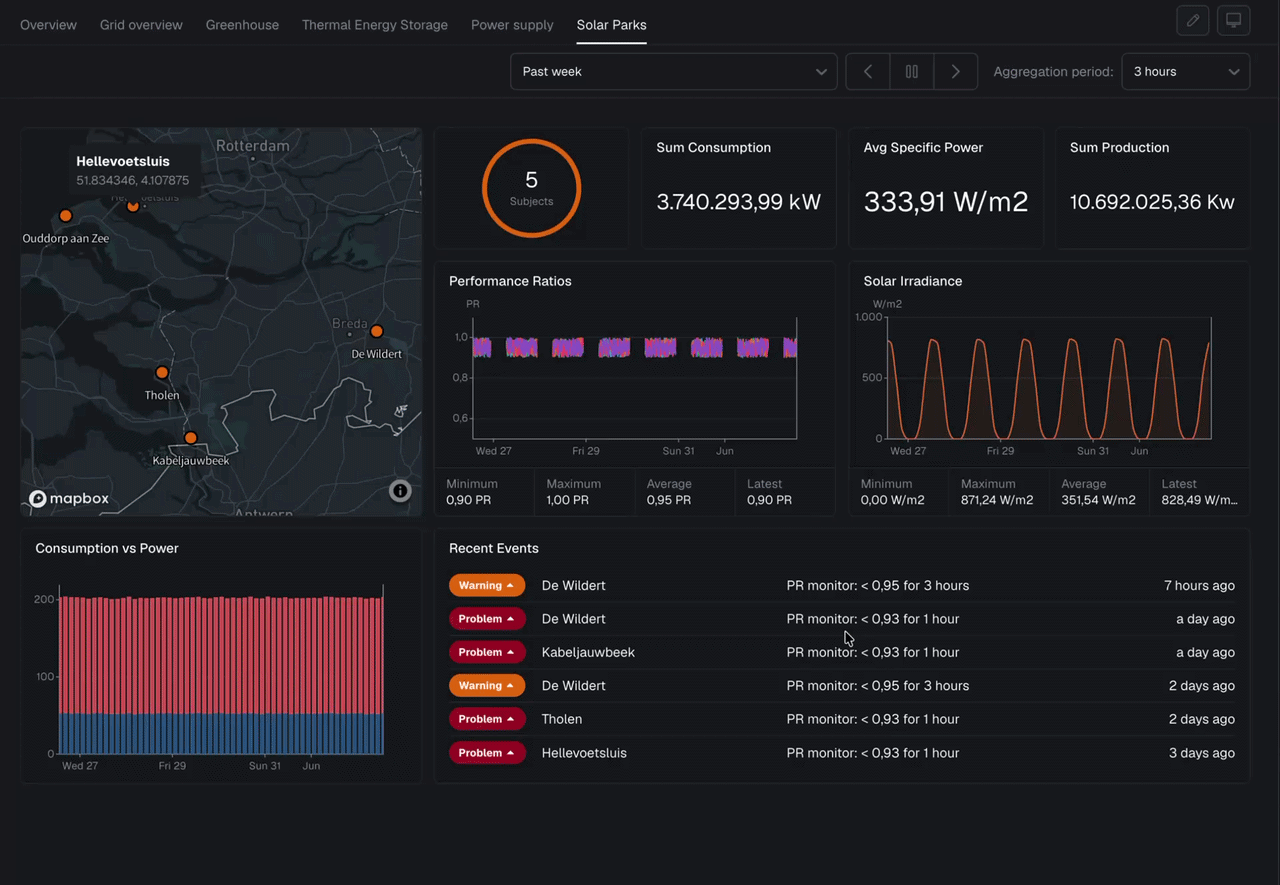
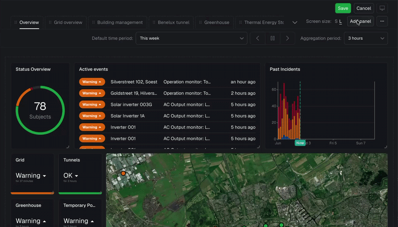
A dashboard can help you summarize your data with easy-to-understand, real-time data visuals based on measurements and events. It helps you to see the most important information at a glance, so you understand what you are doing right and where you need to take action.
To view your dashboard on the big screen or without any distractions, enter Kiosk mode. This creates a full-screen view with no navigation, controls, or tabs. To leave, press Escape.
Configuring dashboards
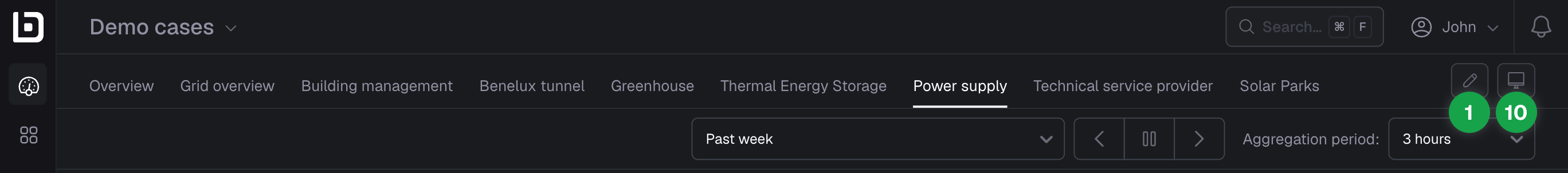
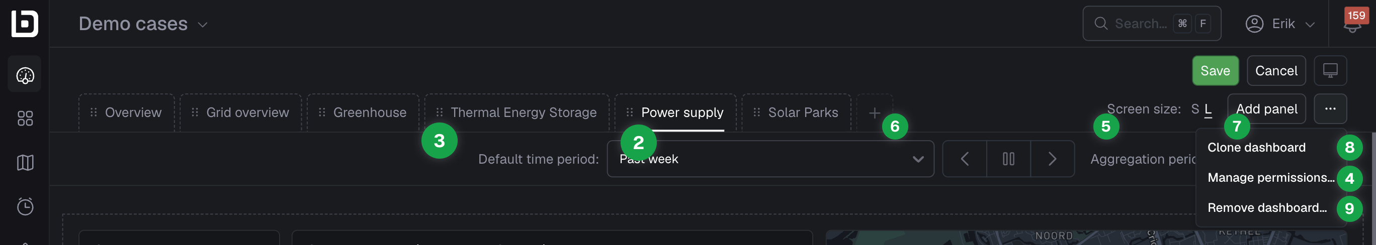
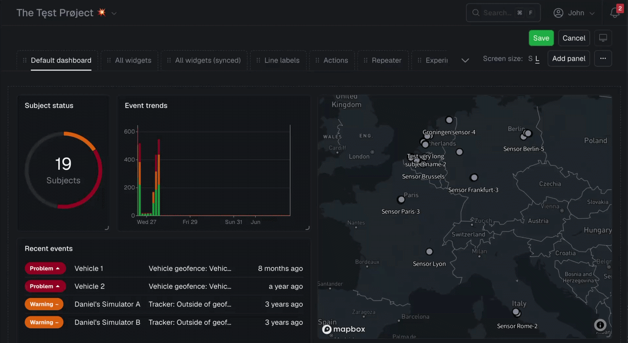
Click the pencil (1) in the top-right corner to enter edit mode. The active dashboard is highlighted (2) — click its name to rename it. Reorder dashboards by dragging the six-dot handle on each tab (3). Adjust the layout per screen size with the screen size selector (5), add a new dashboard with the plus button (6), or add a panel to the current one (7). The three-dot menu gives access to manage permissions (4), clone (8), or remove the dashboard (9). Click Save to apply your changes or Cancel to discard them. For a distraction-free view, enter Kiosk mode (10).
Dashboard layout
The dashboard layout has several configuration options for the different screen sizes. You can adjust the panel sizes and drag them where you want. The maximum number of columns you can use is 12.
Manage permissions
Narrowing down who can view and edit different dashboards is really important, so we added the option to manage those permissions right here in the dashboards themselves.
Layout configuration per screen size
Screen size matters. Each screen size has a unique layout in terms of panel sizes and order, so you can visualize things differently when you look at dashboards on smaller screens.
Configuring widgets
Widgets are the building blocks of your dashboard. Each widget displays a specific type of data, so you can combine them to build a complete picture of what matters most to you.
Adding panels
The next step is to add panels to your dashboard. Panels divide your dashboard into more manageable chunks of visual information that allow you to see what you are doing right and where you need to take action or improve.
Click on the ‘add panel’ to open the pop-up with an overview of widget types you can add to the panel.
Widget types
Depending on the widget type you can display different types of data. The widgets come with a preview, so play around with the settings to get the right visualization.
Line chart
A line chart is a regular graph with values of data to display on the y-axis and time period on the x-axis. The following data can be displayed for the line chart.
| Data to display | Explanation |
|---|---|
| Subject status | Show the highest event level for subjects during a selected time period. |
| Events | Show the number of events that were active during a selected time period. |
| Measurements | Show an aggregation of measurements for a selected time period. |
Bar chart
A bar chart is a regular graph with values of data to display on the y-axis and time period on the x-axis. The following data can be displayed for the bar chart.
| Data to display | Explanation |
|---|---|
| Subject status | Show the highest event level for subjects during a selected time period. |
| Events | Show the number of events that were active during a selected time period. |
| Measurements | Show an aggregation of measurements for a selected time period. |
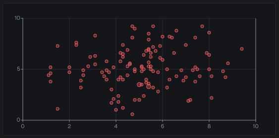
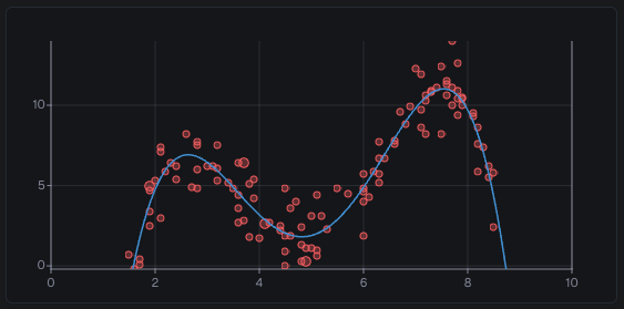
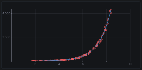
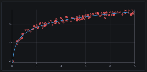
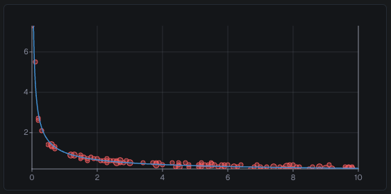
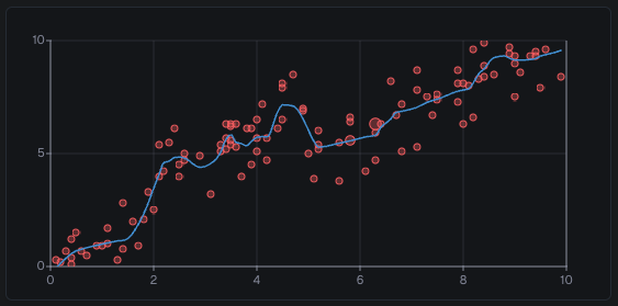
Scatter plot
A scatter plot can be used to visualize two different series against each other by selecting metrics for the x-axis and y-axis. Combinations of x and y values that occur more often are grouped together and will result in bigger dots.
Data to display
| Data | Explanation |
|---|---|
| Measurements | Show a scatter plot for two metrics of the same subject. |
Configuration options
| Option | Explanation |
|---|---|
| X/Y axis | The metrics to display on the X and Y axis respectively. |
| X/Y axis aggregation | The aggregation functions to apply to the X and Y axis respectively. |
| Time period | The time period over which to show points. |
| Aggregation period | The period to which measurements are aggregated into a single point using the aggregation functions. |
| Regression line | Show a line of calculated statistical regression based on the specified algorithm (more about the algorithms below). |
| Show reference line | Show an arbitrary line for specific values at certain points. |
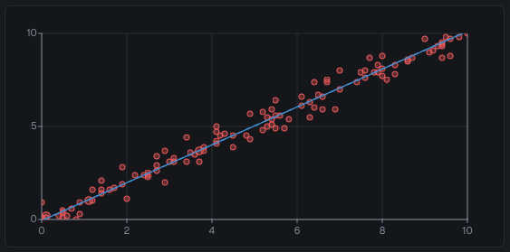
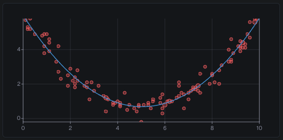
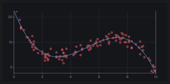
Regression line algorithms
| Algorithm | Explanation | Formula | Example |
|---|---|---|---|
| None | No regression line is shown. | ||
| Linear | A simple straight line. The same as a polynomial with degree 1. | y = ax + b | |
| Quadratic | A simple curve. The same as a polynomial with degree 2. | y = ax² + bx + c | |
| Cubic | A more complex curve. The same as a polynomial with degree 3. | y = ax³ + bx² + cx + d | |
| Polynomial | A curve up to the 10th degree. The degree (n in the formula) can be either a static number or a property value. | y = axⁿ + bxⁿ⁻¹ + … + d | |
| Exponential | A curve that grows slowly at the start, then quickly scales to infinity. In the formula, e represents the Euler constant. | y = aeᵇˣ | |
| Logarithmic | A curve that grows fast at the start, then slowly grows with infinitely smaller numbers. The logarithmic base defaults to the Euler constant (e in the formula) and can be overwritten with a static number or property value. | y = a·logₑ(x) + b | |
| Power Law | A curve that starts at infinity, drops very quickly to a near zero value, and then slowly decreases with infinitely smaller numbers. | y = ax⁻ᵇ | |
| LOESS | Abbreviation for “locally estimated scatterplot smoothing”. This curve does not follow an equation, but instead it locally gravitates towards points depending on the bandwidth. The bandwidth ranges from 0 to 1, with 0 meaning the line will simply go from point to point. Increasing the bandwidth causes the line to loosen up and makes it smoother. |
Pie chart
A pie chart is a type of graph in which a circle is divided into sectors that each represent a proportion of the whole.
| Data to display | Explanation |
|---|---|
| Subject status | Show the number of subjects grouped by their current or highest status. |
| Active events | Show the number of events that are currently active for subjects and triggers. |
| Events | Show the number of events that were triggered during a selected time period. |
Gauge chart
A gauge chart presents a single number as a meter reading. The chart includes thresholds, so you can review the chart quickly to determine whether this number is within a targeted range.
| Data to display | Explanation |
|---|---|
| Number measurements | Show an aggregation of measurements or a most recent measurement value. |
Single value
The single value widget displays a text or numeric measurement value.
| Data to display | Explanation |
|---|---|
| Number measurement | Show an aggregation of measurements or a most recent measurement value. |
| Text measurement | Show the most recent measurement value for a text metric. |
Table
A table can visualize various data sources in a list view.
| Data to display | Explanation |
|---|---|
| Active events | Show a list of events that are currently active for subjects and triggers. |
| Events | Show a list of events that have been triggered during a selected time period. |
| Measurement statistics | Show a list of subjects ordered by an aggregation of measurements. |
| Recent measurements | Show a list of recent measurements for a specific series. |
| Subject overview | Show a list of subjects with their current metric and property values. |
Map
The map widget displays subject locations colored by their highest event status, as well as measurements with a selectable color scheme for visualization.
| Data to display | Explanation |
|---|---|
| Subject locations | Show the current primary location of subjects with their status on a map. |
| Measurements | Show measurements values for subjects at their current location on the map. |
Status badge
The status badge shows the highest combined status.
| Data to display | Explanation |
|---|---|
| Combined status | Show the highest status for subjects and triggers for a selected time period. |
Title
The title shows text, optionally with subject metadata in repeaters or on subject dashboards.
| Data to display | Explanation |
|---|---|
| Text | Show a title that can be used as a divider to group other panels. |
Text
The text widget shows rich text, including tables, images, and links, formatted with Markdown.
| Example | Formatting | Explanation | ||||||
|---|---|---|---|---|---|---|---|---|
| Bold | **Bold** | Bold text. | ||||||
| Italic | *Italic* | Italic text. | ||||||
| ~~Strikethrough~~ | Text that is revised. | |||||||
| External links | [External links](https://www.blockbax.com) | Links to external web pages. | ||||||
| Internal links | [Internal links](/explorer) | Links to other pages in Blockbax. | ||||||
| Links to other projects | [Links to other projects](/projects/{PROJECT_ID}/explorer) | Links to pages on other projects in Blockbax. | ||||||
| office@blockbax.com | <office@blockbax.com> | Links to send an email to a specific address. | ||||||
Code or other terminology | `Code` or `other terminology` | Typically used for code, but could contain any special terminology or properties worth highlighting. | ||||||
| Rotterdam | {City} | In subject dashboards, you can use variables. Typing a single opening curly brace ({) opens a context menu from where you can choose which variable to display in the text. All textual and numerical properties are supported, as well as id, external id, and name, and parent subject metadata if a parent subject is set. | ||||||
| **~~*Combinations*~~** | Combine any of the above styles. These formats also work in combination with links, any of the block style formats below, or in the middle of a word. | |||||||
| - First item - Sub item - Second item - Third item | Unordered lists. | ||||||
| 1. First item 1. Sub item 1. Second item 1. Third item | Ordered lists. | ||||||
| | Left aligned | Middle aligned | Right aligned | | :----------- | :------------: | ------------: | | Separate the | header row | using dashes | | Tables can be added using pipes | and dashes - to separate columns and the header row. A header row is required for the widget to recognize your table. | ||||||
This is a quote | > This is a quote | Quotes or other standout text. | ||||||
| ```json { “metric”: “Temperature”, “value”: 21, “timestamp”: 1672652303 } ``` | A block of formatted code. | ||||||
 |  | Images are supported as well. Note that there is no way to resize the image. |
Image
The image widget can only be used on a subject dashboard to display an image that has been defined as a property value.
| Data to display | Explanation |
|---|---|
| Property value | Show an image to visually identify a specific subject |
Repeater
With the repeater widget, you can configure one or more panels once and have them repeat for all subjects of a subject type. It can also use subject composition to create dashboards that dynamically adjust to your subject hierarchy.
A subject filter can be configured to narrow down the subjects for which the panels will be repeated. When combined with subject composition, it can be used to define a dynamic amount of repeated widgets on the parent dashboard based on the number of children it has.
Conditional
The conditional widget adjusts content visibility based on the property values a subject has. This functionality allows you to control what information is displayed depending on all sorts of specific conditions.
Custom
Custom widgets allow you to build your own dashboard visualizations for use cases specific to your project. Need a hand? Get in touch and our expert services team will help you design and build your custom widget.
Widgets are built with React and styled from the style tab using standard CSS. Requests made through the api prop are executed by the Blockbax platform on behalf of the end user, the widget itself should not contain any Blockbax access tokens or API keys.
Props
The widget function receives the following props:
| Prop | Type | Description |
|---|---|---|
api | Blockbax.Api | Proxy for interacting with the Blockbax platform. Mirrors the public API (e.g. api.getSubjects(...), api.getMeasurements(...)), and exposes two additional helpers:• api.getImage(imagePath) — loads an image stored on an image property value and returns it as a blob URL.• api.navigate(path) — navigates to another page within the current project. External URLs are also supported and open in a new tab. |
contextSubject | Blockbax.Subject | The subject the widget is rendered for. Only set when the widget is placed on a subject dashboard or inside a repeater. |
dateRange | Blockbax.DateRange | The dashboard’s currently selected date range, includes fromDate, toDate, and aggregationMs. |
refreshTick | number | Increments whenever Blockbax wants the widget to refresh its data. Use it as a dependency in React.useEffect. |
Good to know
Each widget may make up to 10 requests through api per refresh cycle, and additional requests throw a rate limiting error. The allowance resets whenever refreshTick or dateRange changes. In addition, all custom widgets on a dashboard share a combined limit of 20 requests per refresh tick.
Widgets run inside a sandboxed iframe and are treated as an opaque origin, which means browser APIs that rely on a normal origin (like localStorage) are not available.
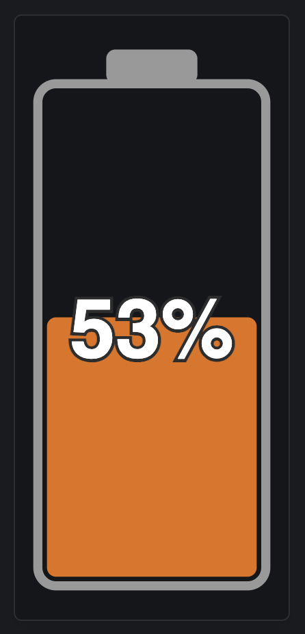
Example
The example below uses SVG to render a schematic battery image with percentage indicator that also highlights the current status. It demonstrates how to fetch data, react to changes in refreshTick, and navigate within the platform.
| |
| |