Docs
Scatterplot improvements
September 30, 2025
We’re excited to announce new enhancements to our scatterplot dashboard widget. These improvements make it easier to uncover trends and spot anomalies in the correlation between metrics. We have introduced regression lines and reference lines, along with several other improvements.
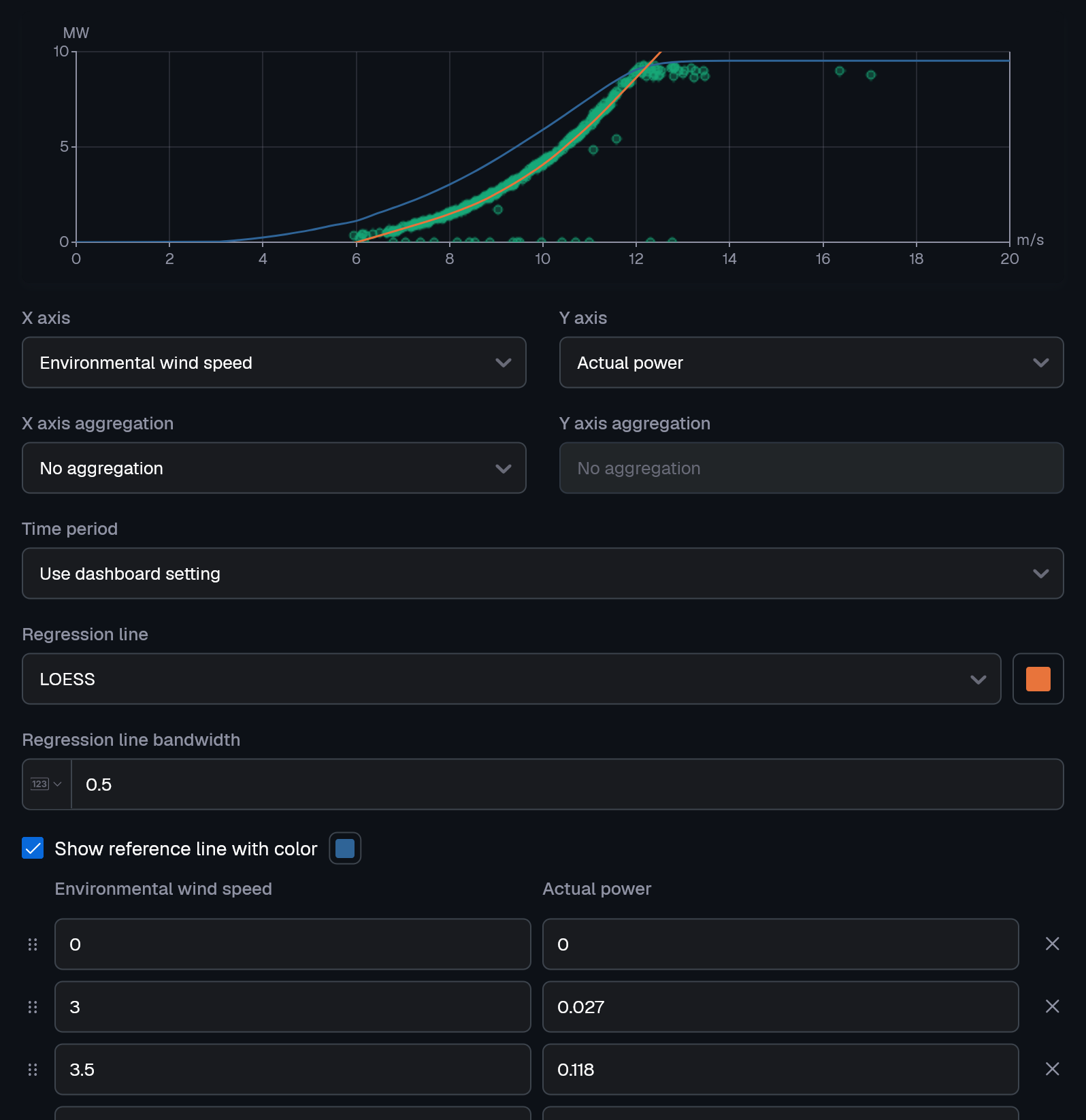
- Regression lines show the overall trend or relationship between two metrics. You can configure different algorithms in the widget settings, including linear, polynomial, exponential, logarithmic, power law, or smoothing.
- Example: Wind speed vs. power production (understanding wind turbine performance).
- Example: Asset age vs. failure rate (predictive maintenance).
- Reference lines let you manually set specific values or thresholds to track against KPIs.
- Example: Acceptable limits.
- Example: Warranty levels.
Beyond regression and reference lines, the scatterplot widget now includes:
- Aggregations: Compare minimums, maximums, or other statistical combinations across your dataset.
- Interactive zooming: Select an area by dragging to zoom in, making it easier to explore details in dense data clouds.
- Dot sizing & transparency: Spot recurring patterns instantly - similar values are shown as larger dots and transparency is added to ensure overlapping dots remain visible.
Improvements
- Close UI dialogs and tooltips with the Escape key
Fixes
- Fix UI highlight after adding new dashboard panels and condition sets
- Fix API to accept null values in collection based request parameters