October 23, 2019 · 4 min read
Blockbax Platform highlights October

We 💚 fast data, but we also love fast and frequent releases. New features are added daily, and this blog series will showcase our favorite new features. This blog’s highlights:
- Subjects map overview
- Explore to discover
- Compare with previous period
- Graph visualization improvements
- Simulated metrics
- Integration update
- Pro-tip: smart aggregation and auto-refresh
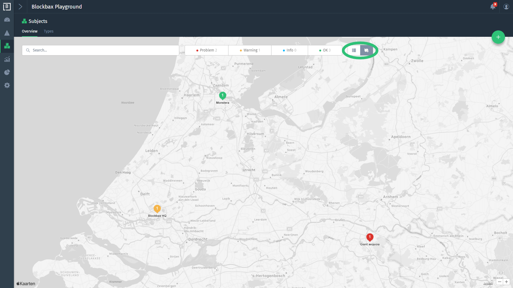
Subjects map overview
The cover of this blog has already revealed it: subjects can now be visualized on a map. The color of the map marker indicates the status of the subject to give you an instant view on the health of the subjects. Use the buttons (see screenshot) to toggle between the list and map view. Make sure you set subject property values for the latitude and longitude if you want to see the subjects on the map.
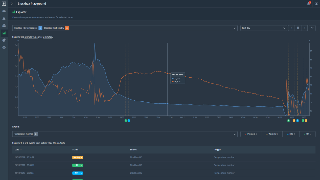
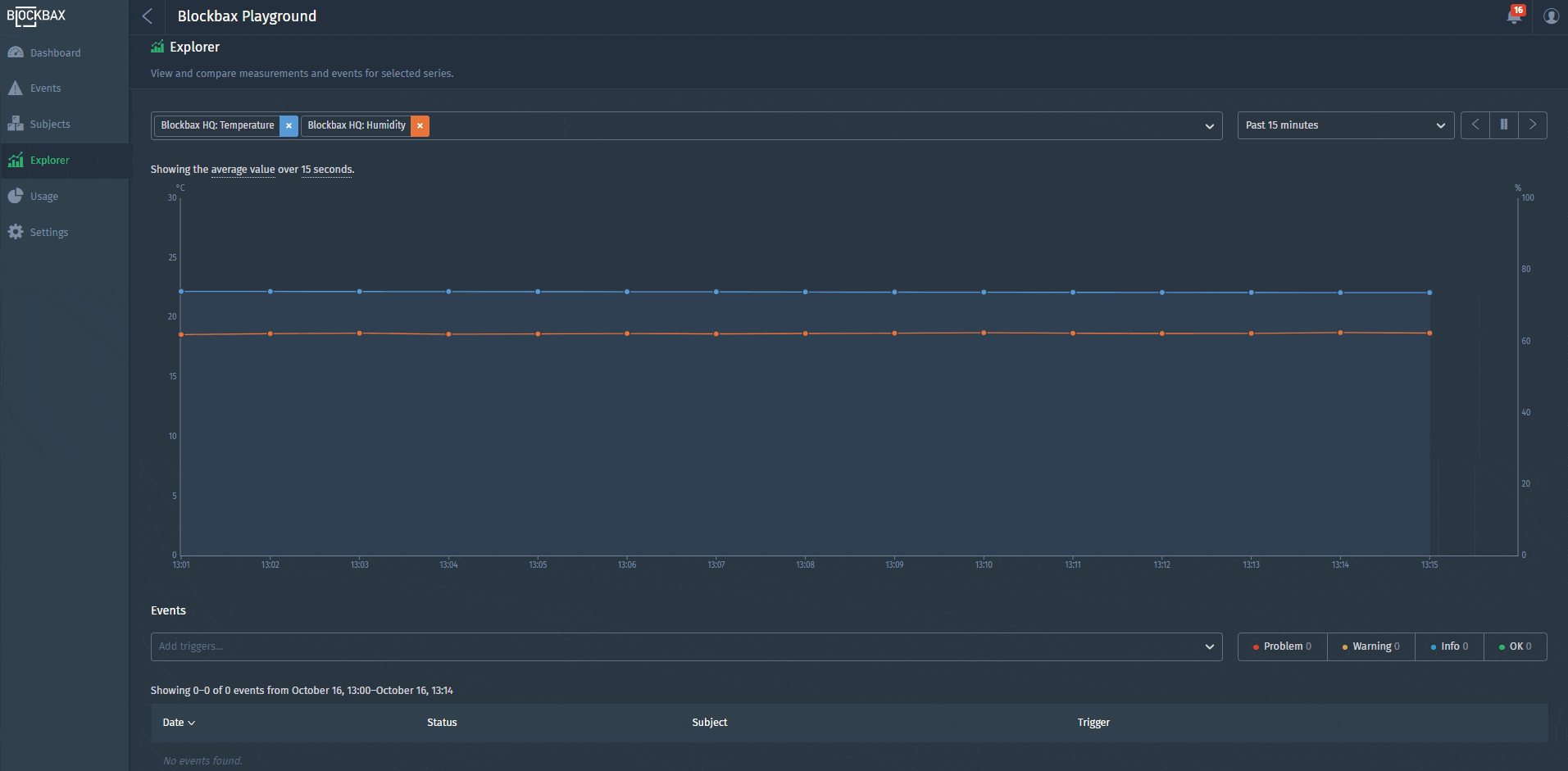
Explore to discover
The explorer is brand new and gives the flexibility to view and compare measurements and events for any series you like. The combination of a subject and a metric is called a series. Have fun while exploring your data to get insights. More information can be found in the explorer docs.
Compare with previous period
What if you could compare the data of today with the data of yesterday or previous week in one graph? This powerful feature is implemented in the platform since a couple of days. Try it out in the explorer yourself or see the example below.
Screenshot example: two series are selected in the explorer to show data of the past hour with the comparison mode enabled. This results in solid line with data of the past hour and a dashed line with data of the hour before per series.
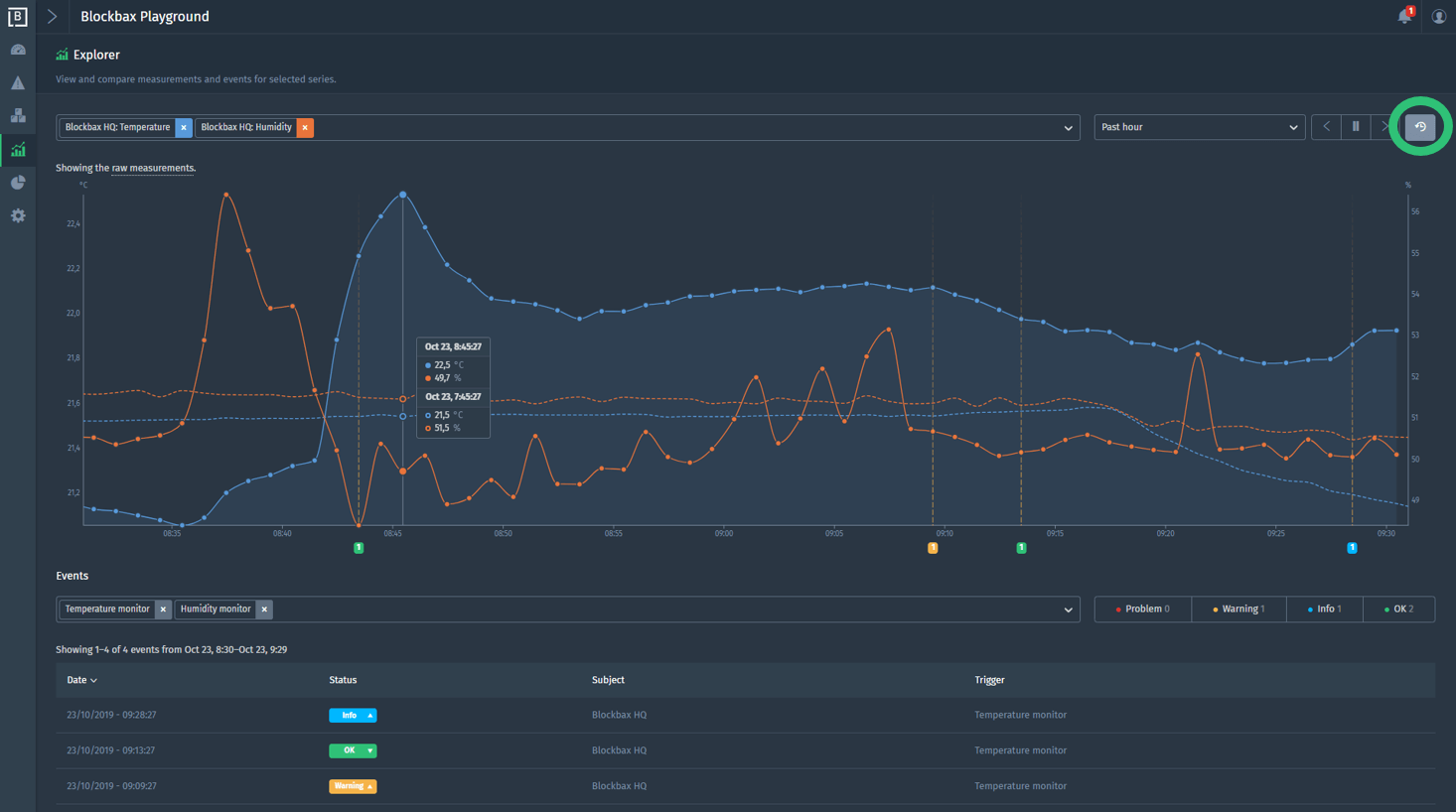
The explorer documentation provides more information about this feature.
Graph visualization improvements
To our customers and our own pleasure, we implemented some graph visualization improvements. Here’s what’s new:
- Y-axis lower bound: determine a lower bound for the metric. Leaving empty will result in a lower bound based on the data.
- Y-axis upper bound: determine a upper bound for the metric. Leaving empty will result in a upper bound based on the data.
- Stale time (minutes): the graph will show gaps when data is not received within the stale time. E.g. set the stale time to two minutes, when it is expected to get a measurement every minute.
- Hide from subject dashboard: a graph can be (temporarily) hidden from the subject dashboard by checking the box.
The docs on graph visualization provide more detailed information.
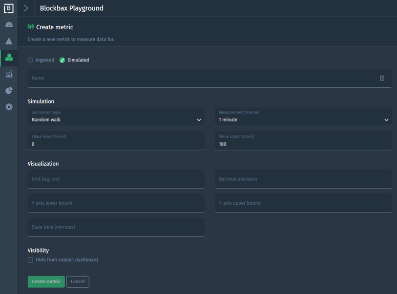
Simulated metrics
It’s all in the name. A subject type can be enriched with a metric that generates measurements based on a simulation configuration. This is especially useful to discover the platform and prepare demos, because you do not have to set up the connectivity with a device, sensor or other external system.
Integration update
Our integration documentation and API docs have been updated as the integration of our platform is made simpler and more straightforward. From now on, messages contain the Ingestion ID, which is either derived from the Subject External ID and Metric External ID (subjectExternalId$metricExternalId), or a custom ID that a user can configure.
Pro-tip: smart aggregation and auto-refresh
The period selector determines the default aggregation time. Click on the aggregation time to choose a different time-span. This might sound fuzzy, so let us show you this feature:
Have you seen the auto-refresh in this video? Graphs refresh automatically every 5 seconds when the pause button is not active. No need to manually refresh. 😃
Enjoy using all these cool new features, and stay tuned for more highlights in the coming months!
Cheers,
The Blockbax Team.