June 24, 2020 · 3 min read
Blockbax Platform highlights
We 💚 fast data, but we also love fast and frequent releases. New features are added daily, and this blog series will showcase our favorite new features. This blog’s highlights:
- Subject dashboard
- More dashboard widgets
- Download CSV and PNG
- Measurements usage insights
- Pro-tip: Dynamic tooltips
Subject dashboard
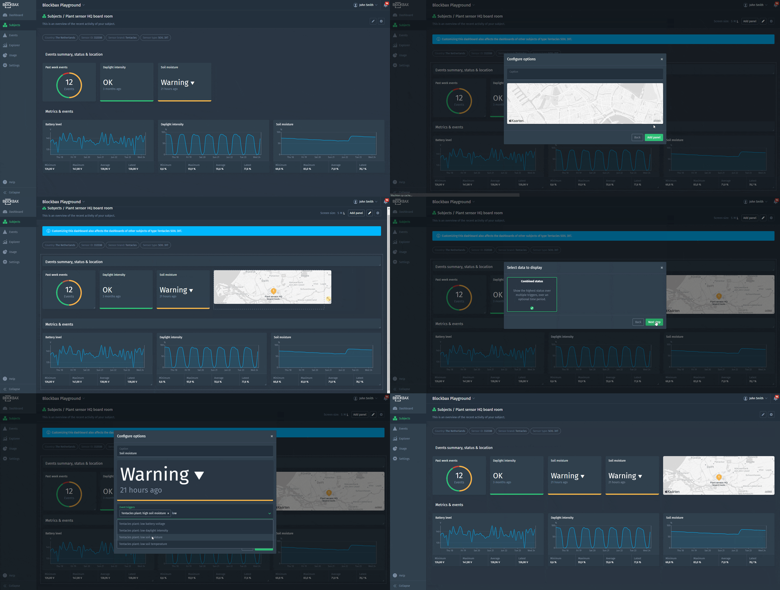
Our goal was to align the way dashboards are built between the project dashboards and the subject dashboard. This has been achieved, so you can now create a rich subject dashboard:
- Resize and order panels to adjust the panel sizes and drag them where you want.
- Layout configuration per screen size to keep your dashboard to the point no matter the screen size.
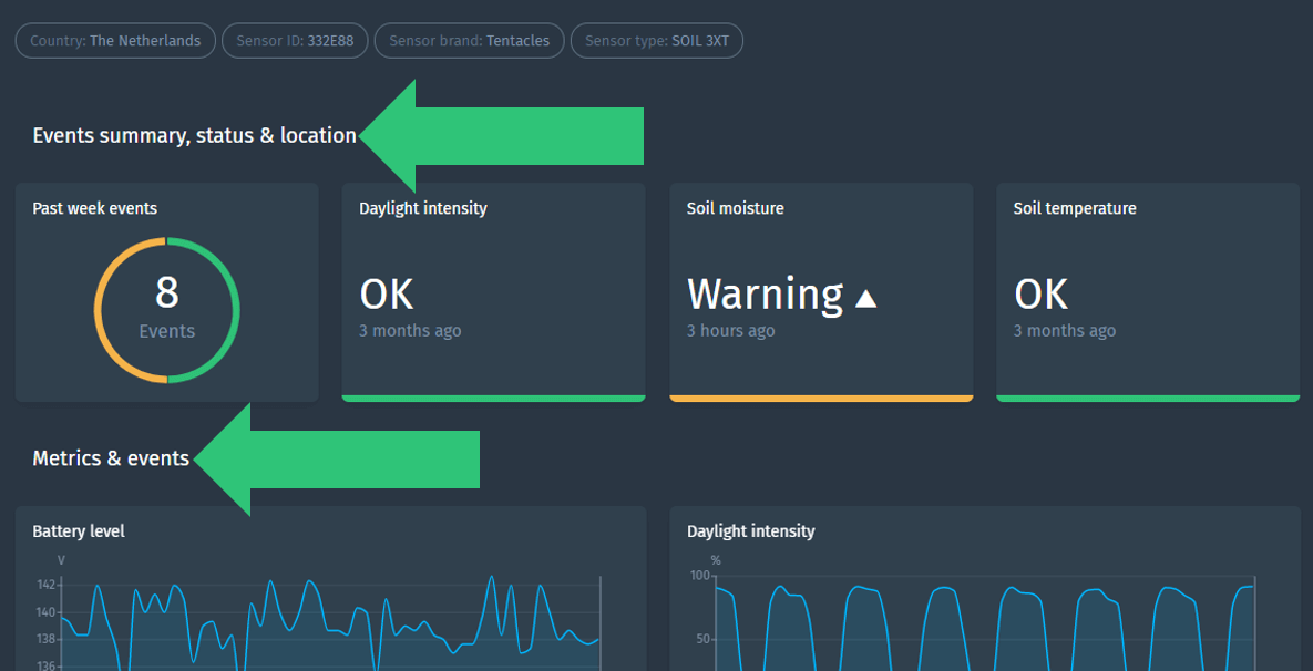
- Adding panels to divide your dashboard into more manageable chunks of visual information.
- Widgets to display different types of data. All widgets automatically use the context of the subject you are looking at.
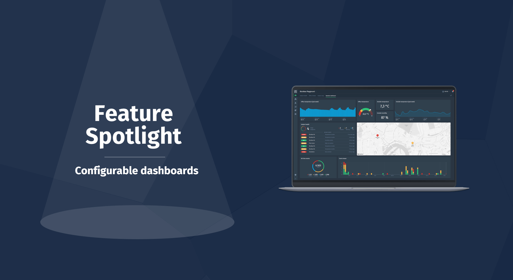
Check our last Feature Spotlight blog about configurable dashboards to get more insights on this topic or read the dashboards docs to get all ins and outs.
More dashboard widgets
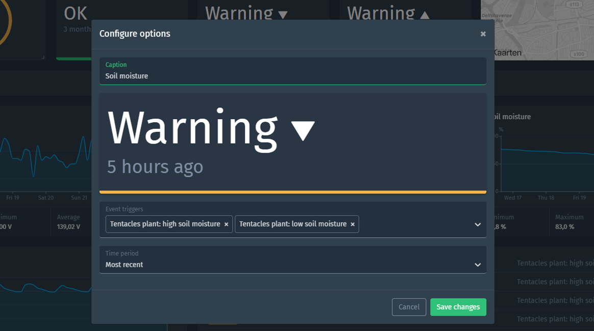
The set of widgets has been expanded with a badge to show the highest combined status and a title to divide your panels. The status badge is redesigned and the configuration is extended, so you can show the highest status over multiple triggers and time period.
The title is some text that can be used as a divider between panels. Simple, but effective!
Download CSV and PNG
We are happy to fulfill the need of multiple customers to download the data points that are used to build the graph in the Explorer. You can download the data points as CSV or PNG.
Measurements usage insights
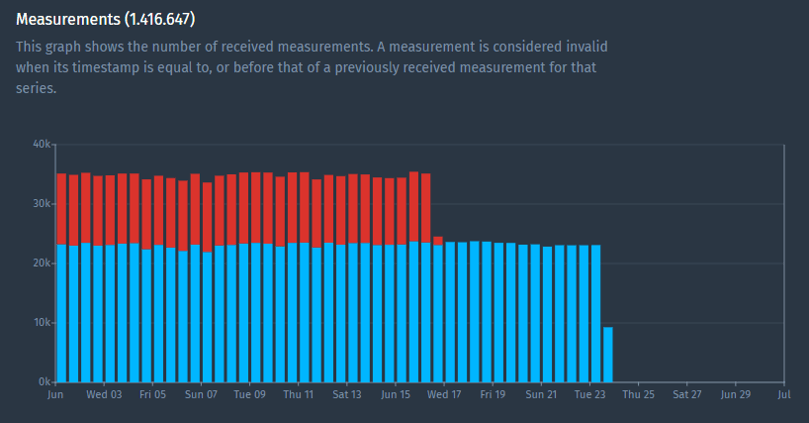
We improved the visuals regarding the measurements usage. The bar chart shows the invalid measurement more clearly, so project members can easily detect them and take action to make sure the next measurements are valid. More info on this topic can be found at the docs about measurements usage.
Pro-tip: Dynamic tooltips
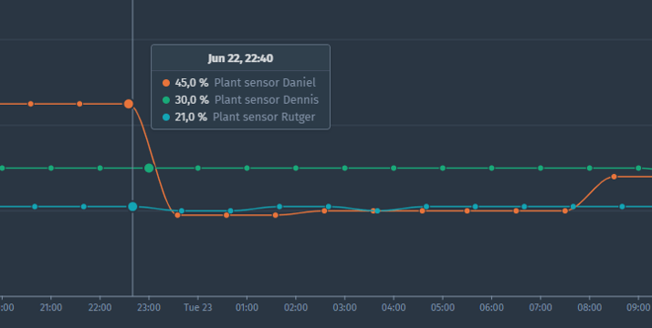
The platform allows to show graphs with all kind of cross sections of your data. For example, in the Explorer you can use properties, aggregations, subjects and multiple metrics to build your graph. We always try to present you with the best possible short description in the tooltip, so you immediately know what you are looking at.
Cheers,
The Blockbax Team.
