December 15, 2023 · 4 min read
Blockbax Platform highlights

We 💚 fast and frequent releases. New features are added on a daily basis, and this blog series will showcase our favorite new features. This blog’s highlights:
Embed API
Have you ever wanted to embed a Blockbax line chart in a system of your own? We’ve got good news for you! Recently we’ve released a brand new API, namely our Embed API to extend our platform by allowing users to embed Blockbax our interactive line charts with your measurement data on any desired webpage.
To embed a linechart you will simply need to configure the correct parameters as stated in our documentation Below we’ve featured an embedded Blockbax line chart, take a look and interact with the graph to test it out! Make sure to test out the various functionalities like you’re used to by clicking or adjusting the y-axis, as well as zooming in on a timeperiod by clicking and dragging along the x-axis.
On top of the Embed API we also released a Mendix Blockbax Linechart. This widget allows Mendix Developers to easily configure parameters for the desired linechart and render them right within your Mendix project. Head over to the Mendix Marketplace to read more.
Rich text widget
Rich text comes to Blockbax! We received feedback from our users that they would like to enrich their Blockbax dashboards with descriptive texts with tokens, links, tables, images and more.
The Rich Text widget can be added to your top-level dashboards as well as your subject dashboards. On your subject dashboards you can also make use of tokens of the subject to populate dynamic fields with the rich text widget. we enable the utilization of properties by enclosing the property name within double curly braces, such as {{City}}. All textual and numerical properties are supported, as well as id, external id, and name. Head over to our widgets documentation to learn more.
Have a look below as a Blockbaxer edits an existing rich text widget on a dashboard:
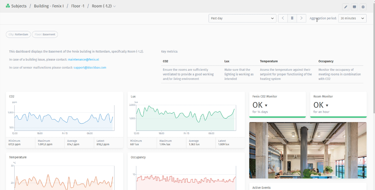
Aggregation period
More data, smaller aggregation? No problem! Recently we released new aggregation periods that can help you analyze your data on a more granular level. In the period selector, you will see a few new option with regard to the aggregation period. Just like before, the granularity of the aggregation period is determined by the selected time period.
For a brief overview of the options, see the table below or head into Blockbax and test it yourself!
| Selected time period | Aggregation periods |
|---|---|
| Past 15 minutes | 1 minute, 30 seconds, 15 seconds, 5 seconds |
| Past hour | 15 minutes, 5 minutes, 1 minute, 30 seconds |
| Past day | 3 hours, 1 hour, 30 minutes, 15 minutes, 5 minutes |
| Past week | 12 hours, 6 hours, 3 hours, 1 hour, 30 minutes |
| Past month | 2 days, 1 day, 12 hours, 6 hours, 3 hours |
| Past year | 3 months, 1 month, 1 week, 2 days, 1 day |
Pro-tip: Text metric click-through
Diving into your recent measurements has always been possible by adding top lists to your desired dashboard. However, clicking through a text value was not possible until now. When clicking through a toplist of text metrics, or a single value text metric you will land on the measurement table view. In this table view you can analyze measurements and filter on metric, subject and time period to see the raw measurements by subjects.
Ready to try it out?
All features and improvements mentioned in this blog are available to use right now! Are you new to Blockbax and do you want to see it in action? You can reach out to us and we will get back to you quickly.
Enjoy using all these cool new features and stay tuned for more editions of this blog series for more new features that we are currently building!
Cheers,
The Blockbax Team.