February 19, 2021 · 4 min read
Blockbax Platform highlights
We 💚 fast data, but we also love fast and frequent releases. New features are added daily, and this blog series will showcase our favorite new features. This blog’s highlights:
- Map layers
- Aggregations in event triggers
- Organizations
- Dashboard widget updates
- Buzzing bell and notification sound
- Pro-tip: Subject highlight in the Explorer
Map layers
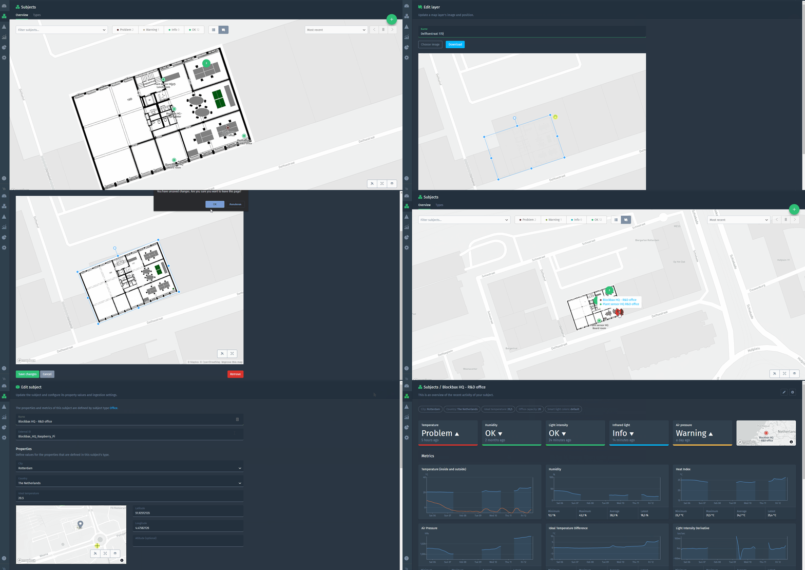
You can now use schematic representations of your office, greenhouse, factory, construction site or any other space as an overlay for the regular map. Hereby you can provide a lot more information about a subject’s spatial context. Upload the map, drag it to the right geographical location and pinpoint your subject at the right spot.
For more details, check out the docs about map layers.
Aggregations in event triggers
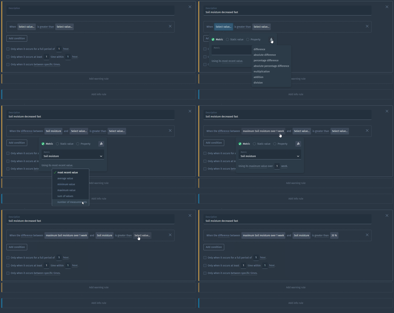
We upgraded our trigger functionality with more power by adding aggregation functions with periods. This makes it possible to generate real-time events based on the (moving) maximum, minimum, average, sum or measurement count of your metric against a change or threshold. Does this sound fuzzy? This example will clear things up:
For more details, check out the docs about aggregations in event triggers.
Organizations
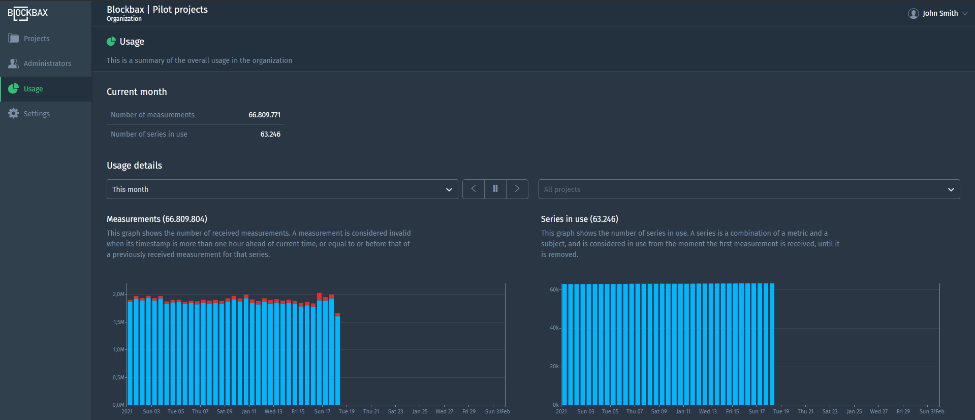
Your project(s) belong to an organization. No matter if you create a project per customer or industry, the organization groups them so you have an overview of the usage and several other aspects. This functionality combined with custom roles in projects makes it possible to go in all kinds of directions regarding multi-tenancy.
This image shows the usage of all the projects that belong to one organization:
For more details, check out the docs about organizations.
Dashboard widget updates
We have updated multiple widgets based on popular user requests. Thanks for your feedback, and go check it out!
Filter your map by trigger
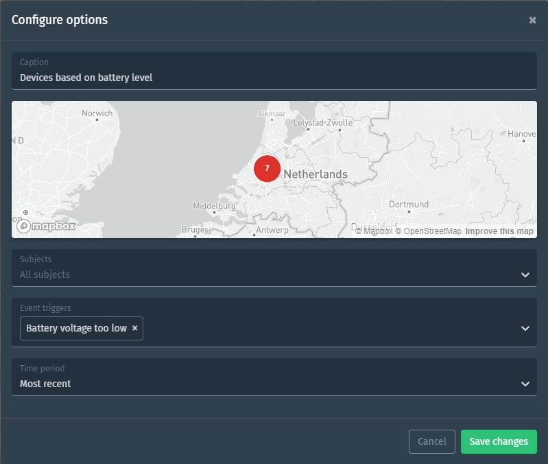
This was requested by multiple users and a logical next step to add to the map. You can now see the status of your subject based on a certain trigger. The widget configuration in the screenshot below will result in an overview on the map with the subject (e.g. device or sensor) status based on the trigger that is evaluating the battery voltage.
Multiple series in a bar chart
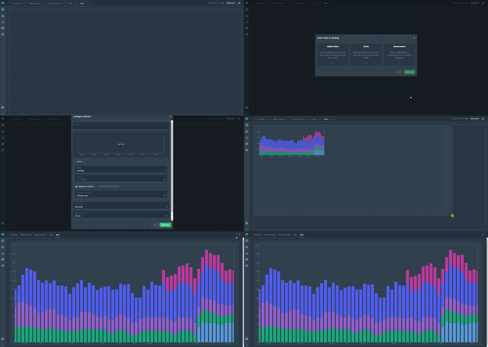
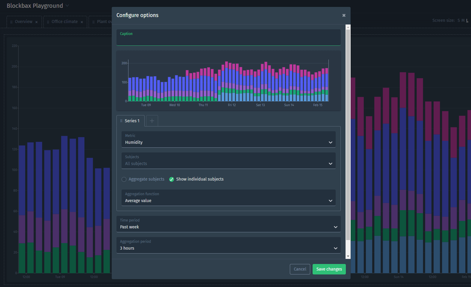
Also favored by many: the ability to show multiple series stacked in a bar chart. It works the same as configuring multiple series for the line chart. Check it out:
Aggregation period for charts
The option to select an aggregation period already existed for the Explorer and is now available in the line and bar chart widgets as well.
Buzzing bell and notification sound
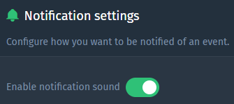
We added new functionality to make notifications pop out more. Visually you will see the bell wiggle when a new notification is received (internally nicknamed the “ding-a-dong”) and optionally you can enable a sound to get your attention. The sound is also played when your project is running in your browser in the background. You can always turn it off in the notification settings.
The Things Network integration
Our platform provides a native integration with The Things Network. Connect your devices to the open-source LoRaWAN network of the The Things Network and read the corresponding integration documentation to publish measurements to your Blockbax project.
Pro-tip: Subject highlight in the Explorer
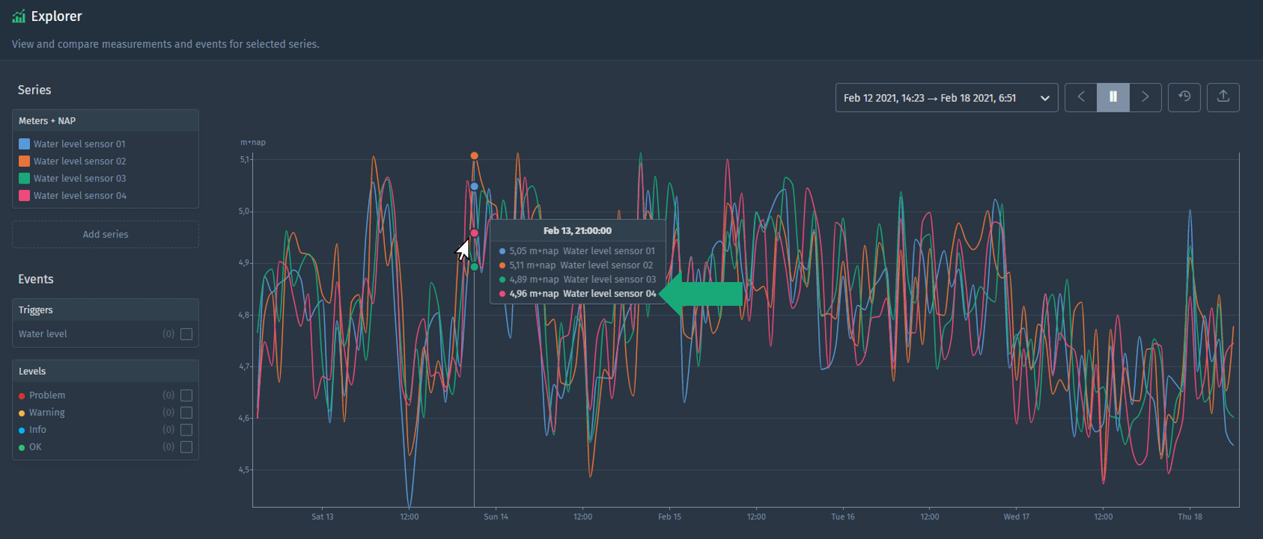
The position of your mouse determines which subject is highlighted in the tooltip. In the example below, the mouse cursor is closest to the pink dot which means that the subject that belongs to the pink dot is highlighted in the tooltip (see the green arrow).
Ready to try it out?
All functionalities mentioned in this blog are available to use right now! Everyone can start using it in their project(s). Are you new to Blockbax and do you want to see it in action? You can reach out to us and we will get back to you swiftly.
Enjoy using all these cool new features and stay tuned for more editions of this blog series with more new features that we are currently developing!
Cheers,
The Blockbax Team.
