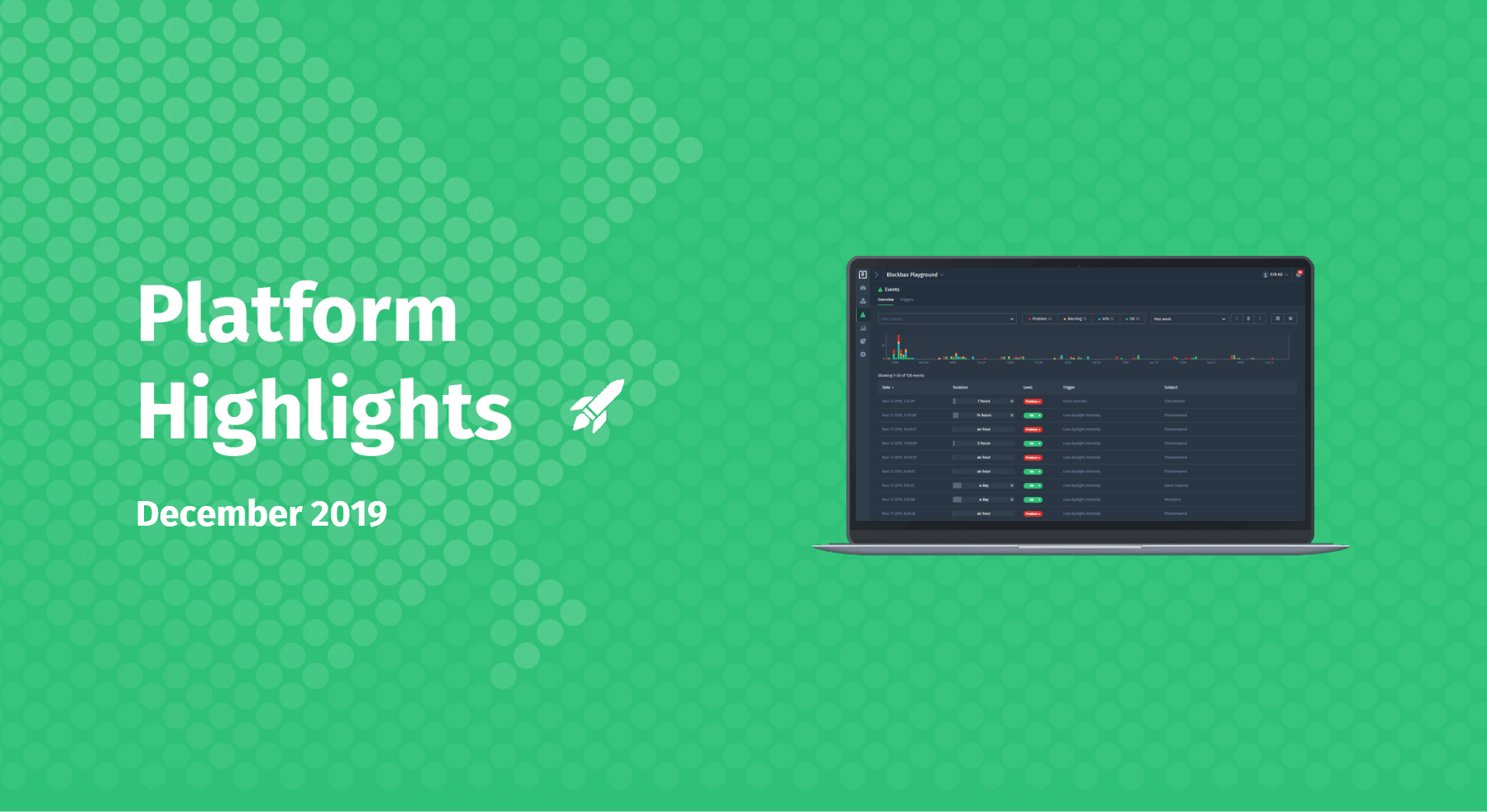
March 13, 2020 · 3 min read
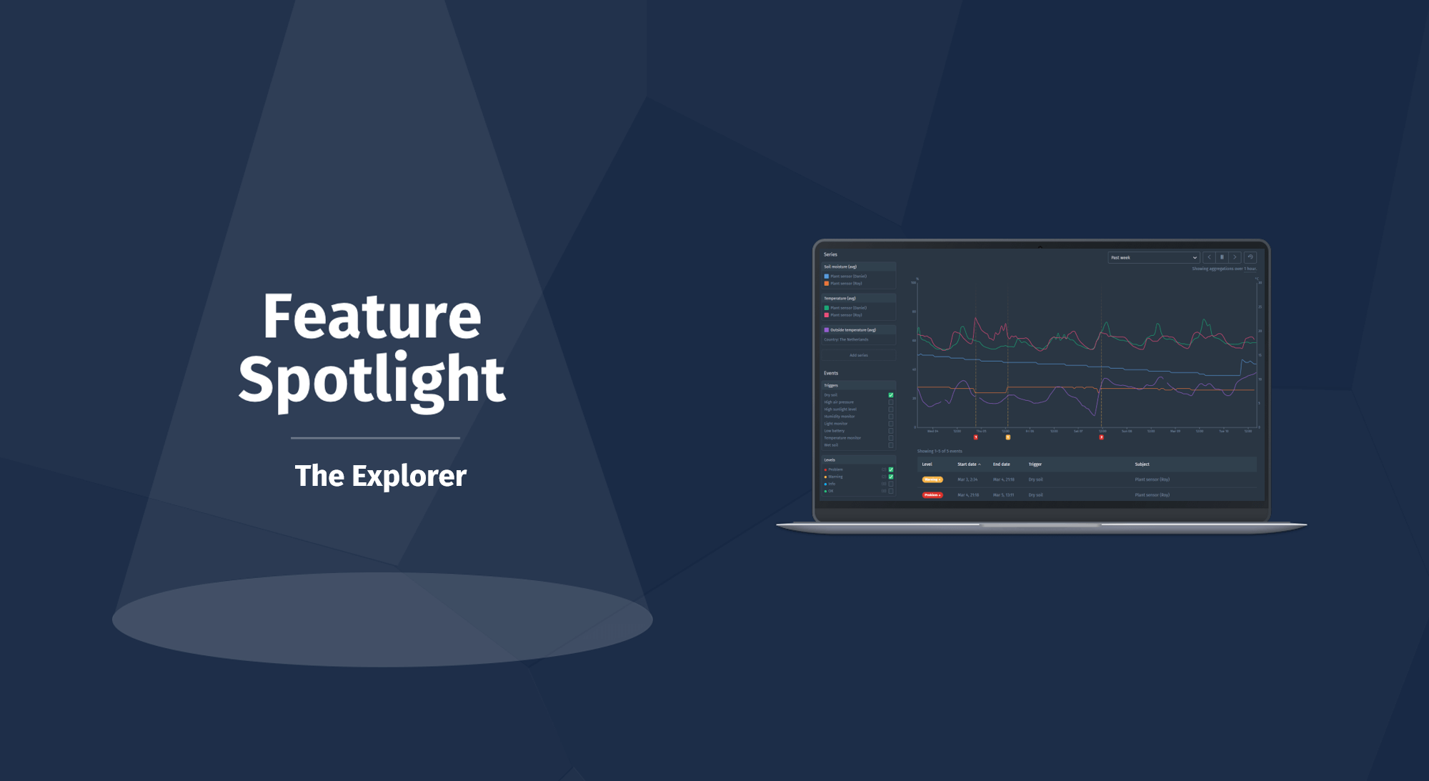
The Explorer
The Explorer is a user-friendly and quick way to view and compare measurements and events of different subjects. We recently redesigned this part of our web app to allow for more powerful and richer ways to examine measurements and events. This blog will dive deeper in the new possibilities of this powerful feature.
You can use the Explorer to compare data of different types of sensors and search for valuable patterns to act upon. One of the major feedback points we received from you was a easier way to compare larger groups of subjects. Of course we listened! We mixed the received feedback with our own vision to create this redesigned version.
Next we will walk you through the different (new) functionalities.
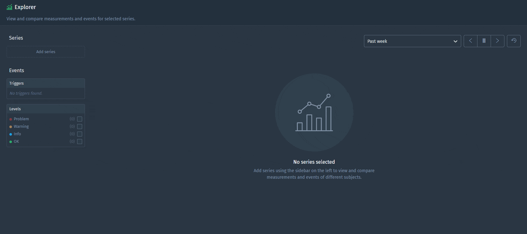
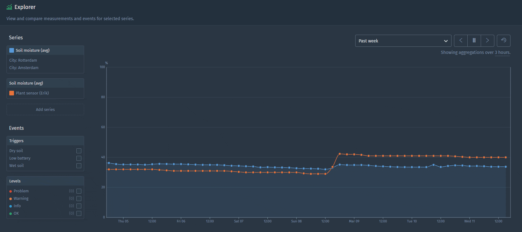
Compare measurements
We made comparing measurements metric-centric instead of subject-centric. So, from now on, you have to select a metric first (remember: metric-centric) and then add subjects one-by-one or use a property to select multiple subjects at once. It’s up to you to draw either:
- An individual line for each subject
- An aggregated line for a group of subjects
Let us show you the power of the Explorer with some examples.
Show data of one metric for an individual subject
Like in the earlier version of the Explorer you can still select a metric and subject to show one series, however additionally you can now select multiple subjects in one go. You can add subjects individually or add multiple subjects at once based on a property. So, do you want to compare the soil moisture of all different plant sensors in Rotterdam and Amsterdam? Let’s try.
Show data of one metric aggregated over multiple subjects
When you select multiple subjects you are presented with the opportunity to “Aggregate subjects” or “Show individual lines”. This easy choice is a powerful addition we made. The first option aggregates subjects together, for instance to compare your plant’s soil moisture to the average of a larger group. Let’s see how this works.

View events
You might also be interested in what events are triggered related to the subject and metrics you selected. As in the earlier version, you can select the trigger and/or levels that you want to be shown as an overlay on top of your chart. In this way you can easily investigate data that triggered the events.
Enjoy playing around with this cool redesigned feature and stay tuned for future feature spotlights to come!
Cheers,
The Blockbax Team.