June 12, 2024 · 2 min read
Scatter plot
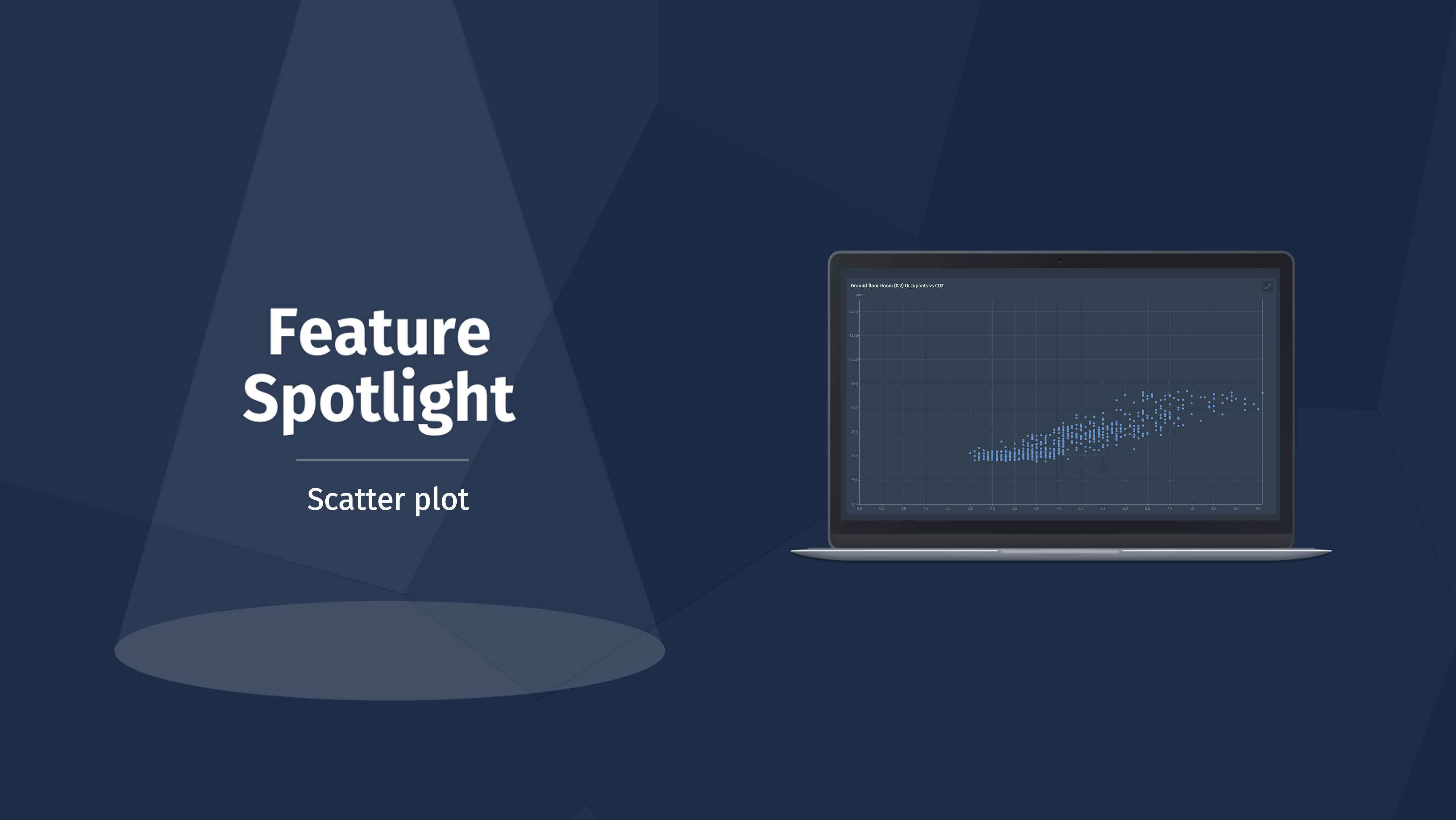
Welcome back to another Feature Spotlight! Today we’re happy to announce a brand new widget that has been released on the Blockbax platform, namely the scatter plot. Our customers provided valuable input regarding this new visualization, and we’re proud to put it on show today.
Most widgets that you can use on the Blockbax platform are visualized with time on the X axis. This can be very useful to track trends over time, however some customers wanted to plot two separate metrics against each other to identify relations between metrics and check on outliers. To achieve this, we would like to introduce the scatter plot.
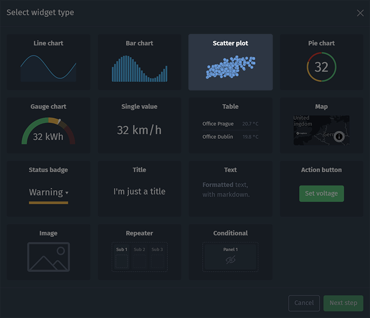
When adding a new panel to one of your subject dashboards, or within a repeater on a global dashboard you can now select the new scatter plot.
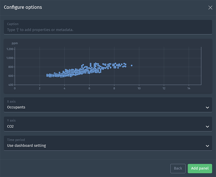
At the time of release, you must have context of a single subject, and you can compare two separate metrics from the same subject. Below you’ll see a configured scatter plot comparing occupants and CO2 in a room. We expect higher CO2 levels when more occupants are in the room.
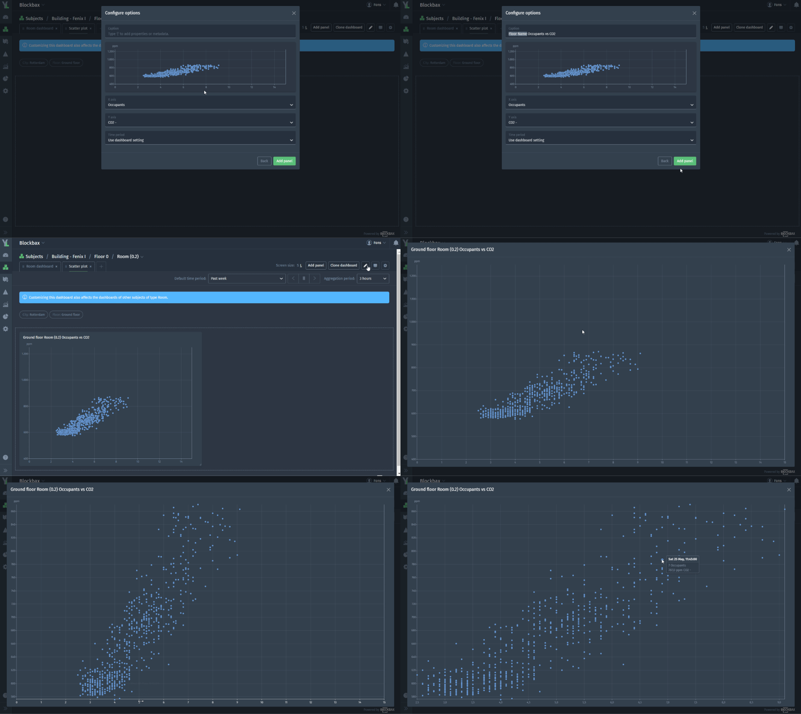
Once you’ve added the scatter plot to your dashboard, you can of course resize and move the panel to your liking. You can then also expand it to full screen by clicking on the arrow and last but not least you can also click on the axes when expanded to fit the axis to the values displayed in the plot. Have a look below at a Blockbaxer configuring the widget by adding a dynamic caption with tokens, resizing the panel, expanding to full screen and fitting the values to show the most detailed view of the displayed metrics.
We’re thrilled to release this new widget and are curious to see how our customers will use it, alongside the valuable insights that will be created through this powerful new visualization.
Happy dashboarding,
The Blockbax Team
